How to choose a style direction for a photo
With 30 styles on offer, what stalls most people isn’t the app. It’s not knowing which style this particular photo wants. Here’s a method with three questions, and the order matters.
Three questions, in order
1. What is the light doing?
Light sets the shortlist, so it comes before the subject. Soft light from an overcast sky or a window has no hard split between dark and bright, which suits the quiet, understated directions.
Noon sun, flash and street lamps are hard light. They arrive with a shadow shape already drawn, so pick a direction that enlarges that shape into something graphic. Night and low light mix colour temperatures; look for a direction that turns the mix into a feature.
2. Who or what is the subject?
People, pets, landscapes and objects tolerate restyling very differently. People tolerate least, since a slightly wrong face ruins the picture. Objects tolerate most, so you can give them the boldest styles.
3. Atmosphere or poster?
Atmospheric directions, the cinematic, misty and papery ones, keep more of the photograph. Poster directions like colour fields, cut paper and collage flatten it into design.
Both work on the same file; they just do different jobs. Atmosphere is for a wall or a profile picture. A poster is for a cover, or for sending to someone.
What each exhibition is good at
01 · Quiet Portraits

Choose it when the light is soft, there are one or two people, and you want a better version of yourself.
02 · Printed Matter
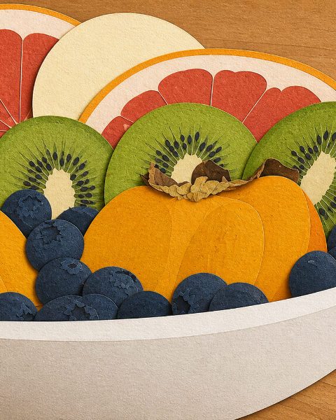
Choose it when the outline is clear, the colours already separate, and the background is simple.
03 · Dream Geography
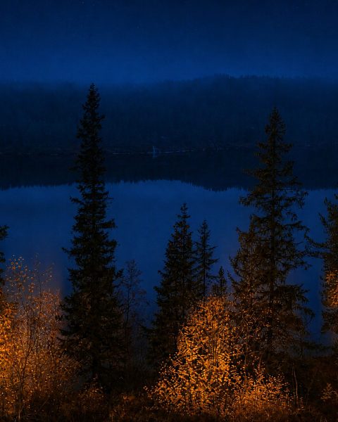
Choose it when the landscape leads, the frame has depth, and the weather or the hour is the point. Portraits work if the person stays small in the scene.
04 · Graphic Light
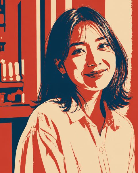
Choose it for hard light and a good shadow shape, if you don’t mind losing background detail. An overcast photo will look thin here.
05 · Material Studies
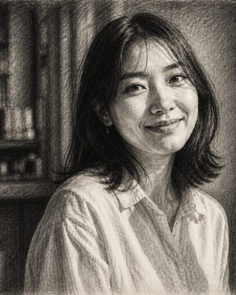
Choose it when you want a surface you could touch and colour matters less.
06 · Small Cinemas
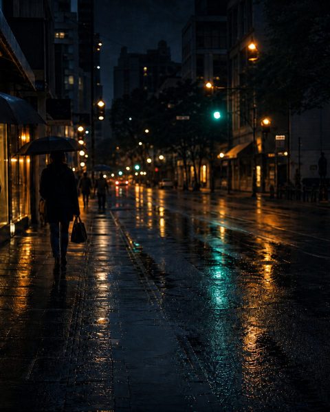
Choose it for street and night scenes with lamps in the frame and a hint of story.
Edition 02 · Small Press
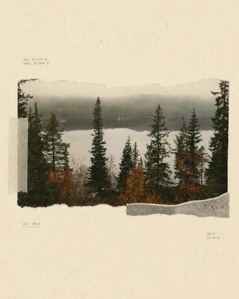
Choose it when you want something that works as a cover rather than a photograph.
If you still can’t decide
Then don’t. After import, the app reads the image for subject, head count, exposure and sharpness, and recommends styles with a reason, such as “preserves soft face light”.
For a first run, set strength to balanced, fidelity to high and composition to keep. Get one result that hasn’t drifted, then decide whether to push toward bold.
Two more habits. If a result disappoints, switch exhibitions rather than trying the next style in the same one; styles within an exhibition sit close together. If the problem is that it doesn’t look like you, the style is rarely to blame. Look at the source photo and the fidelity setting, which another guide covers.
Pick one and see in two minutes
No prompt, just three choices. Your first 3 images are free when you sign up.